First off — I’ll admit that was my poor attempt at a click-bait title. But if you’re still reading the next paragraph, that means it was successful!
Table of contents
- Background
- Am I number 1?!
- Scraping individual event information from the useR Sched website
- Scrape all events data into one dataset
- The moment we all (or at least I) waited for!
- Normalizing for parallel sessions
- Visualizing the data and making observations
- Improvements
- Explore or reproduce the data yourself
Background
Last week I attended the useR 2017 conference in Belgium* — where 1,161 R users from all around the world gathered for 4 days to live and breath R. I still consider myself somewhat new to R (less than 4 years), so I still get extremely excited to go to these conferences! So excited, in fact, that I was fine parting with over $2,000 out of my own pocket to attend…
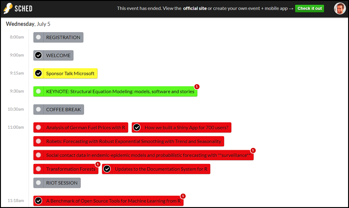
A few weeks before the conference, all attendees received an email with an invitation to a scheduling app/website called Sched. We could use this website to browse through all the events at the conference - keynote talks, lightning talks, regular talks, tutorials, coffee breaks, lunch breaks, and anything else that was in the schedule. We could also mark which events we planned to attend. There was incentive for us to select the talks we planned on attending, because there were often several talks in parallel, and Sched could show me my personalized schedule so that I’d know where to go for the talks I’m interested in.
Screenshot of the Sched website. Checkmarks indicate events that I marked as attending.
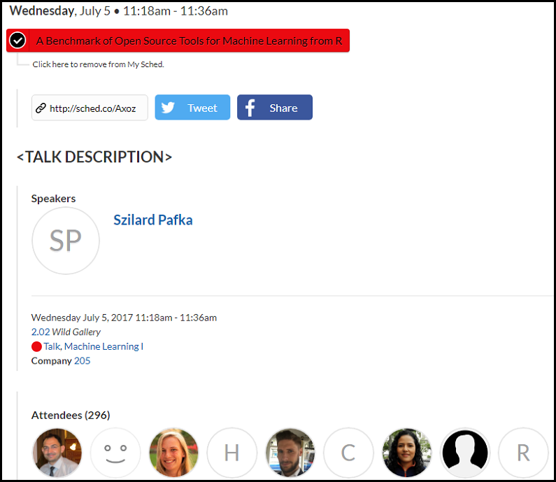
If you click on any event, you are taken to a new page that shows a more detailed view of that event. It will list all sorts of metadata for the event, such as its location, start time, end time, description, and name of speaker when applicable. Each event also keeps track of how many people added it to their own schedules - which was the interesting piece of information for me. This essentially acts as a popularity gauge, by showing how many attendees are interested in each event.
Detailed view of an event
Am I number 1?!
As I was prepping for my lightning talk, I wanted to see how many people said they’d attend my talk (even though I realize the number of RSVP is a very bad estimate for the real attendance). So I went to the event page for my talk and saw that it had 159 attendees.
Great!
But I had no idea how that compares with other lightning talks… I obviously had to investigate the matter further to see where I rank, so I opened the pages of another ~20 lightning talks and checked their attendance numbers. It seemed like I had more attendees than all the talks I checked. Then I thought “why not do this properly? Instead of spending 10 minutes manually opening all the lightning talk pages and looking at that number, I could spend 10 times longer doing it automatically with R!”
(By the way, you can watch my talk here if you’re interested - it’s about a tool I built for making it easier to select colours for your plots.)
Scraping individual event information from the useR Sched website
For anyone who’s not familiar with the term, scraping a webpage means to programmatically extract information from it. What I was manually doing - scanning the main Sched page for any lightning talks, clicking on them, recording the number of attendees from each page - that can be automated, and this process would be called scraping.
Before useR started, I already had the idea that I wanted to scrape the useR schedule website to find out how my talk compared to others. But I haven’t found the time to do it. While at useR, I met Gergely Daróczi, who runs an R meetup group in Budapest, Hungary, and he invited me to give a talk at their next meetup which would be about highlights from useR. I decided this was a good reason for me to actually go through with my mini project, and told him I would scrape the schedule and present any interesting findings.
Next week, while on my Wi-Fi-equipped train to Budapest, I had a few hours to kill so I decided it was a good time to work on this. The best way to scrape the web with R is using the rvest package, and it is very easy to do so.
I noticed that every event page had the same URL pattern of https://user2017.sched.com/event/<ID>. So the first thing I did was write a function get_event_data() that takes an event’s unique ID, reads its event page, and extracts several pieces of interesting information: title, attendance (what I was originally interested in), speaker name, time, location, and event type.
library(rvest)
# Get all info for a talk from its event URL; return a one-row tibble
get_event_data <- function(event_id) {
  # Read the HTML page
  base_url <- "https://user2017.sched.com/event/"
  full_url <- paste0(base_url, event_id)
  content <- read_html(full_url)

  # Extract information from the page
  title <-
    content %>% html_node(".event a.name") %>%
    html_text(trim = TRUE)
  attendance <-
    content %>% html_node("#sched-page-event-attendees h2") %>%
    html_text(trim = TRUE) %>%
    sub(pattern = ".*\\((.*)\\).*", replacement = "\\1", x = .) %>%
    as.numeric()
  speaker <-
    content %>% html_node(".sched-person h2 a") %>%
    html_text(trim = TRUE)
  time <-
    content %>% html_node(".sched-event-details-timeandplace") %>%
    html_text(trim = TRUE) %>%
    sub(pattern = ".*(July.*) -.*", replacement = "\\1", x = .) %>%
    strptime("%B %d, %Y %I:%M%p", tz = "CET") %>%
    as.POSIXct()
  room <-
    content %>% html_node(".sched-event-details-timeandplace a") %>%
    html_text(trim = TRUE)
  type <-
    content %>% html_node(".sched-event-type a") %>%
    html_text(trim = TRUE)

  # Return all event information as a one-row tibble
  tibble::tibble(type = type, title = title, attendance = attendance,
                 speaker = speaker, time = time, room = room)
}
If you’ve never seen scraping code and are unfamiliar with CSS, this code may seem long and complex, but I promise it’s simple. The first few lines read the event webpage, and the rest of the function is simply 6 different variable declarations - one for each piece of information we want to extract. If you want to learn how to write this kind of code (again, I swear it’s not as hard as it looks!), you should look at the documentation and vignettes for rvest.
The event page for my lightning talk is at https://user2017.sched.com/event/AxrJ, so this is the one-row dataframe returned by calling get_event_data("AxrJ"):
| type | title | attendance | speaker | time | room |
|---|---|---|---|---|---|
| Lightning Talk | Plot Colour Helper – Finally an easy way to pick colours for your R plots! | 159 | Dean Attali | 2017-07-06 17:55:00 | 2.02 |
Looks like the function works!
Scrape all events data into one dataset
Now that we have a function that can extract relevant information from an event page using the event’s ID, the next step is to repeat this for all events. But how do we get all the IDs for all the events?
Easy. The main useR schedule page lists all the events in the conference. This means we can simply load the main page, scrape it to find all the links to the events, and in each link we extract out the event ID.
content <- read_html("https://user2017.sched.com")
event_ids <- content %>%
  html_nodes(".event a.name") %>%
  html_attr("href") %>%
  sub("/event/(.*)/.*", "\\1", .)
all_talks <- purrr::map_df(event_ids, get_event_data)
This post is not meant to be a tutorial on scraping, so I will not explain each line of code, but I did try to write it in an easy-to-understand way. sub("/event/(.*)/.*", "\\1", .) is responsible for extracting the event ID from the URL. The end result after running this piece of code is a dataframe with 276 rows - meaning that there were 276 events on the schedule.
The moment we all (or at least I) waited for!
Whew, we made it. Now I can finally answer my original question: were people excited by my talk? (Yes, I realize how vain the premise of this article is…) With a very simple dplyr expression we can now query the data to find the top 5 lightning talks by attendance:
all_talks %>%
  filter(type == "Lightning Talk") %>%
  arrange(desc(attendance)) %>%
  head(5)
| type | title | attendance | speaker | time | room |
|---|---|---|---|---|---|
| Lightning Talk | Automatic Machine Learning in R | 235 | Erin LeDell | 2017-07-06 17:40:00 | 4.02 |
| Lightning Talk | Using R for optimal beer recipe selection | 175 | Benjamin Høyer | 2017-07-06 18:05:00 | 4.02 |
| Lightning Talk | heatmaply: an R package for creating interactive … | 166 | Tal Galili | 2017-07-06 17:50:00 | 2.02 |
| Lightning Talk | Plot Colour Helper – Finally an easy way to pick colours … | 159 | Dean Attali | 2017-07-06 17:55:00 | 2.02 |
| Lightning Talk | R Blogging with blogdown and GitHub | 157 | Joseph Rickert | 2017-07-06 17:30:00 | 3.02 |
4th place. Not even a bronze medal! A crushing defeat, I may not be able to show my face at another R conference. Looks like Erin’s talk was by far the most anticipated.
For curiosity, here are the top 5 regular (non-lightning) talks:
| type | title | attendance | speaker | time | room |
|---|---|---|---|---|---|
| Talk | Show Me Your Model: tools for visualisation of statistic… | 519 | Przemyslaw Biecek | 2017-07-06 11:00:00 | PLENARY |
| Talk | Scraping data with rvest and purrr | 362 | Max Humber | 2017-07-06 11:36:00 | 4.02 |
| Talk | Text mining, the tidy way | 351 | Julia Silge | 2017-07-05 13:30:00 | 4.02 |
| Talk | Programming with tidyverse grammars | 350 | Lionel Henry | 2017-07-07 11:00:00 | 4.02 |
| Talk | How we built a Shiny App for 700 users? | 321 | Olga Mierzwa-Sulima | 2017-07-05 11:00:00 | 4.02 |
Here, too, there was one talk that dominated all the rest.
You can interactively explore this dataset, both in tabular form and graphically, in this Shiny app.
Normalizing for parallel sessions
The talk with the highest attendance was a Keynote by Yves Rosseel titled “Structural Equation Modeling: models, software and stories” with 602 people RSVPing. Does that mean it was the most popular talk?
By absolute numbers, yes. But I think it’s important to take parallel sessions into account when measuring popularity. Out of the 1,161 conference participants, 966 of them used the Sched application (according to a quick rvest scrape I ran). This means that 602/966, or 0.62, of the users RSVPed to Yves’ keynote.
The keynote talk was the only event that was going on at the time, so when looking at the schedule and marking talks to attend, people either chose to attend this talk or to not attend anything (this is a very naive perspective - of course it’s possible they wanted to attend but had a personal schedule conflict for example). On the other hand, the most popular regular talk had an attendance of 519, but there were 5 other talks going on at the same time.
I would argue that assuming all conference goers are attending an event at any given time, the keynote talk should in theory expect to have an attendance of 966. Similarly, if there are 6 talks concurrently, assuming all else is equal, each talk should have about 1/6 of the total attendance, in this case 966/6 = 161. With an expected attendance of 161 and actual attendance (well, not actual, because we don’t know how many people were there, this is based on RSVP) of 519, an attendance ratio can be calculated as 519/161 = 3.22 for the talk. Going by this metric, this talk was more popular than the keynote relative to its expected attendance. This is clearly making a lot of big assumptions and doesn’t account for things like people RSVPing for multiple talks - it’s by no means a correct model for expected attendance - but it’s simple and has some logic behind it.
Using this model, I calculated the number of parallel sessions, expected attendance, and attendance ratio for each talk and added it to the dataframe.
Visualizing the data and making observations
You can play with this data and make these plots yourself in this Shiny app.
Want attendnace? Don’t sponsor the conference, try to get invited!
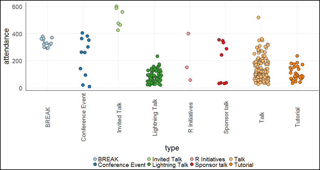
Let’s start with a very simple plot - event type vs attendance.
There’s a few things I quickly noticed when looking at this:
- It’s easy to see there was one lightning talk and one regular talk that stood out from all the rest.
- Invited talks (keynotes) were the most popular events (in absolute numbers).
- Sponsor talks attendance was very bimodal, with half of them being extremely low, and the other half being fairly popular.
- All of the sponsor talks were less popular than the keynotes. There can be many reasons for this (the obvious ones being that keynotes have specific interesting topics and are much longer and are regarded as a main event), but I found it interesting. Perhaps if you want to attract people to your talk, instead of sponsoring the conference you’re better off being invited :)
Does attendance drop off with time?
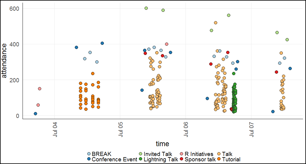
A similar plot can be made for time vs attendance:
The main reason I was interested in this plot was because I wanted to test my theory that attendance was getting lower with time. I had two reasons to believe this: first of all, many people left on the last day (Friday July 7). Secondly, I thought many people would be too lazy to go through all the schedule events and would be less likely to RSVP to events that are later in time simply because they wouldn’t take the time to go through the list all the way down.
Unfortunately, the plot doesn’t show any of these things conclusively. There is a general downward trend on the last day, but without any quantitative analysis I can’t say whether it’s likely a real effect or random.
Quick look at attendance ratios
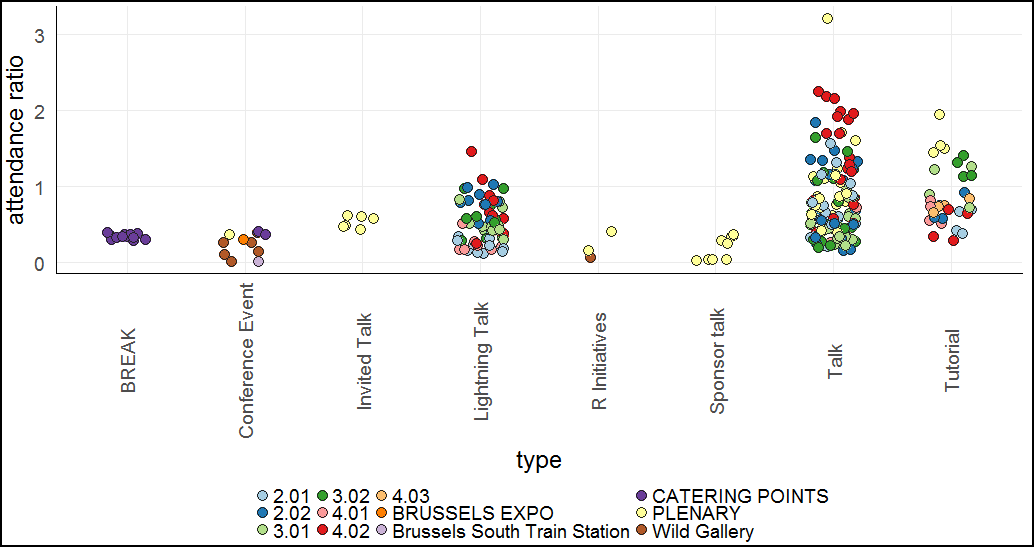
Let’s take a look at type vs attendance ratio instead of absolute attendance. In this plot, the colour grouping is based on room instead of type.
Other than the one talk that stands out with an attendance ratio of >3, which we already knew about, there is one other thing that jumps out at me. It seems like a lot of the popular talks were in room 4.02.
Are some rooms better than others?
Actually, looking at the table above for the top 5 talks, 4 out of the top 5 were in fact in room 4.02. If we calculate the average attendance ratio of all talks in each room, we see that room 4.02 really was the most popular:
| room | attendance ratio |
|---|---|
| 4.02 | 1.33 |
| PLENARY | 0.98 |
| 2.02 | 0.83 |
| 3.02 | 0.73 |
| 2.01 | 0.66 |
| 3.01 | 0.49 |
| 4.01 | 0.43 |
Interestingly, the only top-5 talk that was not in room 4.02 was in the Plenary room, which is second place.
We can look at a similar table for lightning talks instead of regular talks:
| room | attendance ratio |
|---|---|
| 2.02 | 0.76 |
| 4.02 | 0.71 |
| 3.02 | 0.60 |
| 3.01 | 0.54 |
| 4.01 | 0.28 |
| 2.01 | 0.23 |
It’s interesting to see that all the *.02 rooms had talks that were more popular than the *.01 rooms. Remember that when people RSVP to events, they don’t know the room size, they mostly decide based on the title and description. Perhaps the themes of the *.01 rooms were less interesting to more people, maybe because they were more domain-specific? Whatever the case may be, I wonder if the *.02 rooms are bigger, and if the conference organizers anticipated which talks would be more popular and placed them in the appropriate rooms. I’d be very impressed if that is indeed the case.
Correlation obviously implies causation
I wanted to dig a bit deeper into the clear bimodality of the sponsor talk attendance. Here is the data for all sponsor talks (all sponsor talks were in the same room so I omit that column):
| type | title | attendance | speaker | time |
|---|---|---|---|---|
| Sponsor talk | Sponsor Talk Microsoft | 348 | NA | 2017-07-05 09:15:00 |
| Sponsor talk | Sponsor Talk Data Camp | 335 | NA | 2017-07-05 15:30:00 |
| Sponsor talk | Sponsor Talk Open Analytics | 289 | NA | 2017-07-06 09:15:00 |
| Sponsor talk | Sponsor Talk Rstudio | 354 | Tareef Kawaf | 2017-07-06 15:30:00 |
| Sponsor talk | SPONSOR TALK EODA | 38 | Oliver Bracht | 2017-07-06 16:45:00 |
| Sponsor talk | SPONSOR TALK ORACLE | 37 | Mark Hornick | 2017-07-06 16:55:00 |
| Sponsor talk | SPONSOR TALK MANGO SOLUTIONS | 32 | Grace Meyer | 2017-07-06 17:00:00 |
| Sponsor talk | SPONSOR TALK ALTERYX | 34 | Dan Putler | 2017-07-06 17:05:00 |
| Sponsor talk | Sponsor Talk Rconsortium | 243 | NA | 2017-07-07 09:15:00 |
Do you notice what I first noticed? All the sponsor talks that had “SPONSOR” (all caps) in the title had low attendance, while the sponsor talks with “Sponsor” in the title did well.
Coincidence? I think not. Clearly a government conspiracy to shut up some sponsors!
A few other factors that can contribute to this:
- All the low-attendance sponsor talks are for bronze sponsors (silver and gold sponsors had high attendance).
- The gold sponsors had 15 minutes, silver had 10 minutes, and bronze had 5 minutes. Maybe seeing a 5 minute sponsor talk makes it look less interesting because how much can you say in 5 minutes?
- The gold and silver sponsors were always placed just before a keynote talk, while all the bronze sponsors were one after the other in a sort of “sponsor hour”. Maybe it’s like with commercials - when there’s one or two intermingled with your show, you don’t mind watching it, but if there’s a good chunk of time dedicated to them, you might flip the channel (flip the channel? Who still remembers what cable is?!). This isn’t a fair comparison between commercials and sponsor talks, just a little theory.
- In all seriousness, I do think there can be a slight effect to ALL-CAPS vs regular caps. ALL-CAPS titles are sometimes associated with lower quality in my experience, for example when I see articles on Facebook or Twitter. I don’t know if there’s any hidden bias for people against a talk that’s in ALL-CAPS, but maybe?
Improvements
The scraping code and analysis was written on a short train ride and is by no means “good” code. I also did not look at many other things that can be interesting. To name just a few other things I would love to look at:
- Length of each event. Right now, I scrape most of the metadata from each event page, but I did not think of scraping the end time, and therefore calculating the length of each event. It might be a nice addition.
- I also didn’t take the tags of each talk into account - each talk was tagged with keywords, and it’d be interesting to see if any tags are particularly attractive or off-putting.
- This isn’t a realistic option, but it would have been great if we had access to the real attendance of each event. That way we could see how accurate the RSVPs are. For example, I woder how many people indicated on their schedules that they want to attend Erin’s “Automatic Meachine Learning in R” lightning talk as well as my talk in another room, and ended up actually moving between the rooms on such a tight schedule.
- It is also possible to scrape individual people’s schedules (for example here is my schedule), so I’d be interested to see if there are any clusters. Can we predict what talks someone will like based on other talks they chose? I believe Andy Pryke attempted to do something similar for last year’s useR and he mentioned that he didn’t find it particularly interesting.
Explore or reproduce the data yourself
You can interactively explore this dataset to get the same visualizations that I showed and more using this Shiny app.
All the scraping code, Shiny app code, and scraped data is available on GitHub.
Here is a recording of my lightning talk about Plot Colour Helper.
By the way, the slides for my talk in Budapest are here.
By the time I got around to publish this post it’s actually closer to a month ago, but all the data and content in this post are from the week after the conference.
